Data Visualizations
01Oct2024
2D Density Heatmap Representations of Mouse Position

Spatial heatmap of mouse position across all frames
- X and Y axes are position in the open field (units in pixels)
- The X and Y positions for each body part across each frame were used to determine mouse position across time
- Contours in the plot (i.e., the concentric polygons) represent the frequency with which the coordinate values are represented in the dataset
- The contours are filled with a color gradient, which represents the density levels: coordinates with the lowest value density are blue, highest density values are red
Mouse Trajectory
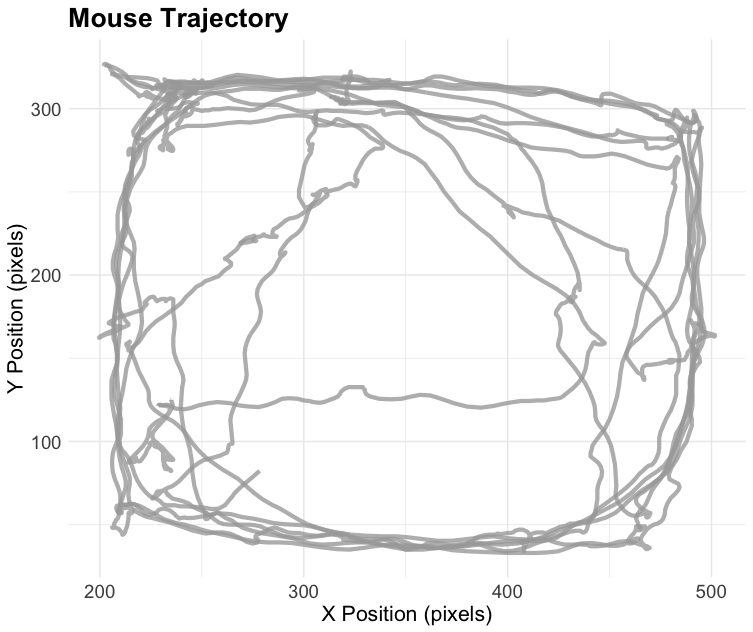
Path of mouse across time
- X and Y axes are open field coordinates (units in pixels)
- Used XBody and YBody to represent the mouse position (omitted zeros)
- Smoothed the data by applying a rolling mean across every 3 frames to reduce noise
Cumulative Distance Over Time for Each Body Part
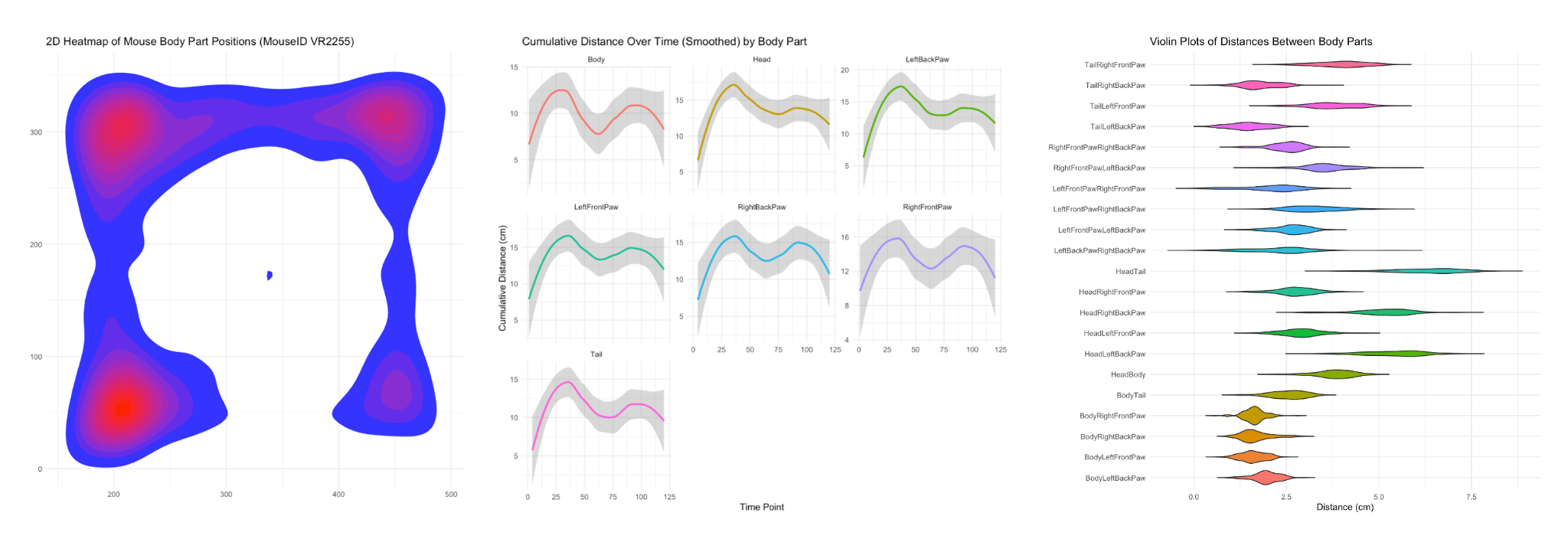
Faceted grid of line plots for each tracked body part across time
- Cumulative distance for each body part is represented by a line with LOESS smoothing (omitted zeros)
- Shading represents 95% confidence interval
- Each plot has the same Y axis (easy comparison)
- No legend (legends are redundant in faceted grids)
Distance Between Body Parts

Violin plot visualizes the distribution of distances between various pairs of body parts (units in centimeters)
- Each violin corresponds to a different body part pair, and is essentially a histogram superimposed on a box and whiskers plot (though omitting the box & whiskers)
- X axis labeling should be cleaner (e.g., "Body - Tail" instead of BodyTail)
- Different color for each violin (rainbow gradient like shown here works well)
